Get a Customized Solution for Your IT Needs
+91 702-705-8777
info@pansofic.com
55-56, 1st floor, Chandigarh Complex, Prabhu Prem Puram, Ambala Cantt, Haryana 133006

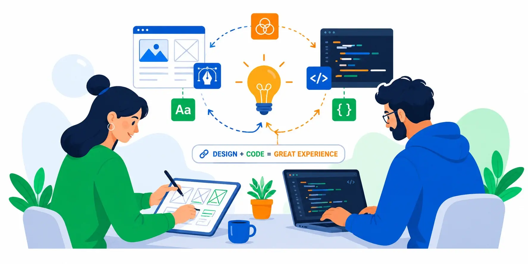
Modern web design isn't about making things "pretty" anymore. It's about understanding human psychology, user behavior, and designing experiences that naturally guide people toward your desired outcomes. It's about conversion optimization, engagement, and building digital products that people genuinely enjoy using.
Every color choice. Every button placement. Every word you use. Every white space on your page.
These aren't random decisions. They're the difference between a visitor becoming a customer and a visitor bouncing away to your competitor.
Modern web design isn't about making things "pretty" anymore. It's about understanding human psychology, user behavior, and designing experiences that naturally guide people toward your desired outcomes. It's about conversion optimization, engagement, and building digital products that people genuinely enjoy using.
At Pansofic Solutions, we've designed hundreds of websites for businesses across India—from e-commerce platforms to SaaS applications to corporate websites. We've learned that great design is data-driven, user-centered, and deeply strategic.
In this guide, we'll reveal how professional web designers think , the psychology behind effective design, and how strategic design impacts your bottom line.
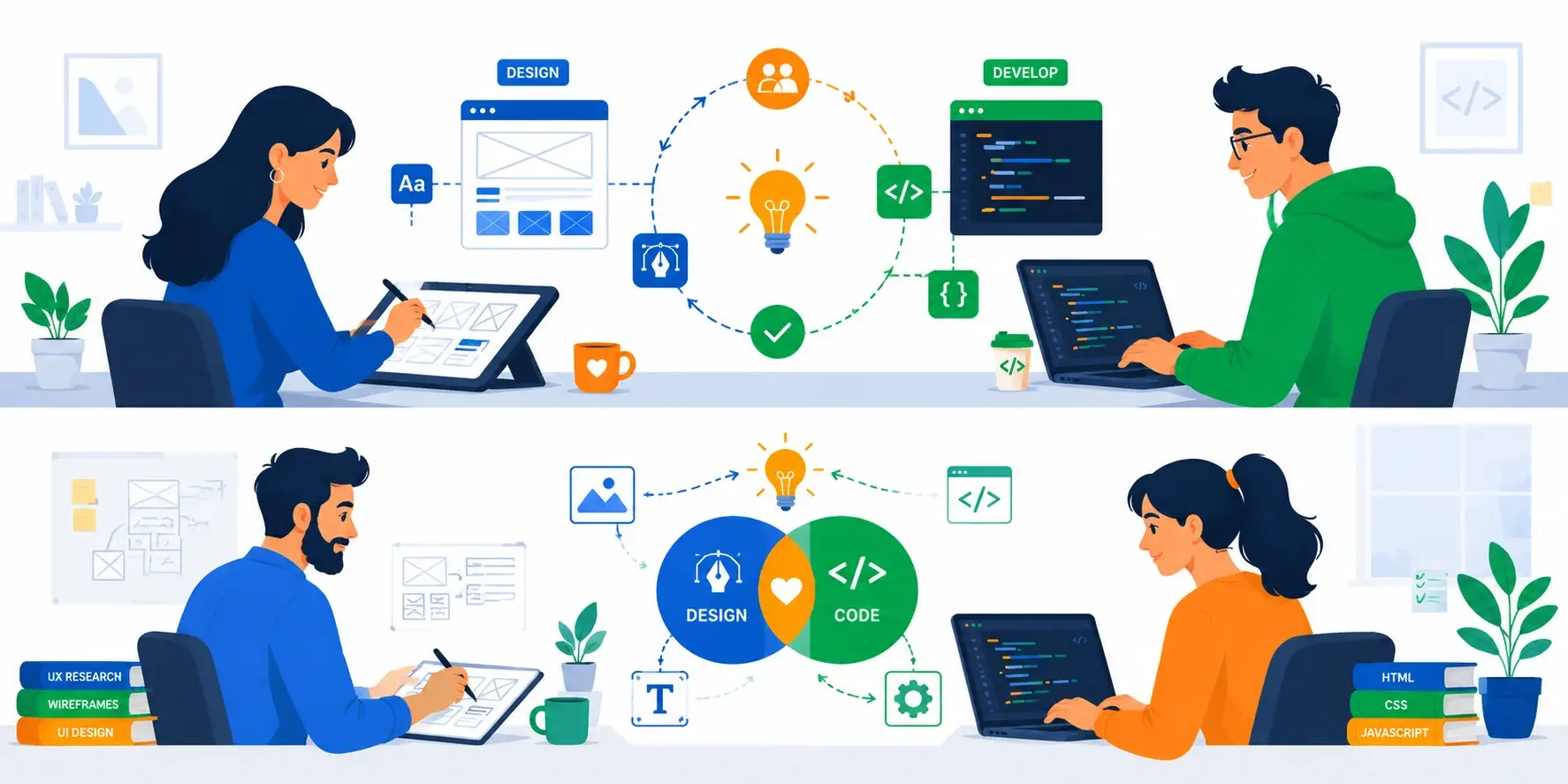
What Is Modern Web Design?
Before we dive deep, let's clarify what "web design" really means in 2026.
There's a misconception that web design is about making things look pretty. That's only one small part.
Modern web design encompasses the following:
Visual Design—Colors, typography, imagery, spacing, layout aesthetics
User Experience (UX) - How easy and intuitive it is to accomplish goals
User Interface (UI) - Buttons, forms, navigation, interactive elements
Information Architecture—How content is organized and presented
Interaction Design - How the interface responds to user actions
Responsive Design - How the design adapts to all screen sizes
Accessibility - Making the site usable for people with disabilities
Design Systems - Consistent components and patterns used across the site
A great web designer thinks like a strategist, psychologist, and craftsperson combined. They're not just making it look good—they're designing for outcomes.
The Psychology of Color in Web Design
Color is one of the most powerful tools in a designer's toolkit. Colors trigger emotional responses, guide attention, and influence decisions—often without people even realizing it.
Red:
Emotion: Urgency, excitement, passion
Example: eBay, YouTube, Amazon use red strategically
Blue:
Emotion: Trust, calm, professional
Example: Facebook, LinkedIn, PayPal use blue heavily
Green:
Emotion: Growth, health, eco-friendly
Example: Spotify, Android, Basecamp
Yellow:
Emotion: Optimism, energy, caution
Example: McDonald's, Slack, Best Buy use yellow accents
Purple:
Emotion: Creativity, luxury, mystery
Example: Twitch, Yahoo, Cadbury
Black:
Emotion: Power, sophistication, elegance
Example: Apple, Nike, luxury brands
White (and Negative Space):
Emotion: Simplicity, cleanliness, breathing room
Example: Apple, Dribbble, Notion
We redesigned a fintech startup's website in Mohali. Their original design used bright red and gold everywhere—which felt chaotic and untrustworthy for a financial service.
We shifted to a calm blue and white palette with strategic red only for CTAs (calls-to-action). The result?
Trust score (measured via survey): 4.2/10 → 7.8/10
Customer acquisition cost decreased 22% (better conversion)
One color change. Real business impact.

Typography: The Silent Persuader
Typography (your choice of fonts) is one of the most underrated design elements. Yet it powerfully influences how users perceive your brand and read your content.
Serif Fonts (fonts with little decorative lines)
Perception: Traditional, formal, authoritative, established
Examples: Georgia, Times New Roman, Garamond
Sans-Serif Fonts (fonts without decorative lines)
Perception: Modern, clean, approachable, friendly
Examples: Helvetica, Arial, Open Sans, Roboto
Script/Handwriting Fonts
Perception: Personal, elegant, creative, expensive
Examples: Pacifico, Playfair Display
Monospace Fonts
Perception: Technical, code-like, precise
Examples: Courier New, Inconsolata, Monaco
1. Font Pairing Use 2-3 fonts maximum, typically:
One serif OR sans-serif for headings
Optionally one accent font (used sparingly)
Successful pairing example:
Heading: Playfair Display (elegant, serif)
Body: Open Sans (clean, readable, sans-serif)
2. Font Size & Readability
Body text: 16px minimum (larger on mobile)
Character width: 50-75 characters per line for optimal readability
3. Font Weight Use different weights to create hierarchy:
Bold (700) for primary headings
Regular (400) for body text
A B2B SaaS company in Chandigarh had excellent messaging but poor typography. Their 12px font with tight line spacing made reading exhausting.
We implemented:
Increased body font from 12px to 16px
Adjusted paragraph spacing
Results:
Average time on page: 1:20 → 2:45
CTA click rate: 8% → 14%
Better typography increased engagement 40%.
The Science of Layout & White Space
White space (or negative space) is the empty area on your page. It's not "wasted" space—it's one of the most important design elements.
1. Improves Readability
Crowded pages are hard to read
Lines of text separated by space are easier to scan
2. Draws Attention
Elements surrounded by white space stand out
Creates visual hierarchy naturally
3. Reduces Cognitive Load
Cramped designs feel overwhelming
Makes interfaces feel calmer and more professional
4. Increases Perceived Value
Luxury brands use generous white space
Spacious designs feel premium
Users don't scan web pages randomly. They follow predictable patterns:
F-Pattern (for content-heavy pages):
User scans across the top
Creates an "F" shape of attention
Design implication: Place most important elements in the top-left, secondary in the left column, and supporting info in the right column.
Z-Pattern (for simple pages):
User scans top-left to top-right
Creates a "Z" shape of attention
Design implication: Place logo/brand in top-left, CTA in top-right, then use this Z-pattern to guide the eye.
A local consulting firm in Ambala had a website packed with information. Every inch was used. The site felt overwhelming, and corporate clients reported "information overload."
We reorganized with intentional white space:
Separated sections with breathing room
Cleaner visual hierarchy
Results:
Bounce rate: 58% → 32%
Client perception of professionalism: significantly improved
White space created clarity and trust.
Navigation & User Flow: Guiding Visitors to Goals
The best website in the world is useless if people can't find what they need. Great navigation isn't just about menus—it's about designing a journey.
Before designing layouts, you need to organize information logically. Ask:
What are users looking for?
How can you organize content to align both?
Principle: The "3-Click Rule" Any important page should be findable in 3 clicks maximum. If users can't find something in 3 clicks, they'll likely leave.
Horizontal Navigation (Top Menu)
Best for: Simple information hierarchies (5-8 main categories)
Example: Amazon, Apple
Sidebar Navigation
Best for: Complex hierarchies, many sections
Example: Documentation sites, admin dashboards
Breadcrumb Navigation
Best for: Large sites with deep hierarchies
Example: E-commerce sites with category hierarchies
Footer Navigation
Best for: Supporting navigation
Example: Contact info, legal pages, sitemap
Mobile-First Design Principle: Design for mobile first, then enhance for desktop.
Mobile navigation challenges:
Limited screen space
Thumb accessibility (users hold phones in different ways)
Solutions:
Hamburger menu (three-line icon) - now standard
Sufficient spacing between touch targets
Your CTA button is where interest converts to action. Design matters:
Button Color:
Use contrasting color (stands out from background)
Color should align with brand psychology
Button Text:
Action-oriented: "Get Started" not "Submit"
Creates urgency if appropriate: "Claim Your Discount" not "View Offer"
Button Size & Placement:
Large enough to be noticeable
Above the fold (visible without scrolling) for critical CTAs
Real Data: A/B testing showed moving the CTA button from right-aligned to center increased clicks by 23%. Changing the text from "Get More Info" to "See Pricing Details" increased clicks by 34%.
Forms: Converting Intention Into Action
Forms are where potential customers become actual customers (or, more often, where they abandon). Great form design is critical.
1. Minimize Fields
Every field you add reduces completion by 5-10%
Optional fields should be marked as "Optional"
Example: A lead generation form with 8 fields had 12% completion. Reduced to 4 fields? 34% completion.
2. Single-Column Layout
Multi-column forms confuse users
37% higher completion rate than multi-column
3. Logical Field Ordering
Easy fields first (builds momentum)
Group related fields together
4. Clear Labels
Labels above fields (not inside)
Error messages that help users fix issues
5. Inline Validation
Show errors as user types, not just at end
Reduces user frustration
6. Progressive Disclosure
Show only relevant fields
Feels shorter and less overwhelming
7. Mobile Optimization
One column on mobile
Avoid captchas (use alternative verification)
An online apparel company in Delhi had an 8-field checkout form with 3.2% conversion rate. Cart abandonment at 8% of users starting checkout.
We redesigned:
Reduced to essential 5 fields (shipping, billing, payment)
Trust signals (security badge, money-back guarantee)
Results:
Checkout completion: 3.2% → 7.8%
Customer satisfaction: Reduced support inquiries by 18%
Images & Visual Content: The New Readability
Humans process images 60,000 times faster than text. Yet many websites use wrong images or poor quality visuals.
High-Quality Photography:
Professional product photography matters (low-quality images scream "cheap")
93% of communication is visual
Hero Images (Large images at top of page):
Creates immediate impact
Must include clear value proposition overlay text
Icons & Illustrations:
Break up text, improve scannability
Should reinforce message, not distract
Infographics:
Explain complex information quickly
Must be mobile-responsive
Great images need to load fast:
Use modern formats (WebP instead of JPEG)
Lazy load (load images as user scrolls near them)
Impact: Properly optimized images can reduce page load time by 40-60%.
Design Systems: Consistency as a Strategic Asset
Large websites and applications need design systems—a set of consistent components and patterns used throughout.
A collection of:
Components—Buttons, cards, forms, etc. designed once, reused everywhere
Patterns - How navigation works, how errors are handled, etc.
1. Consistency
Users trust consistent design
Feels like a coherent product, not random pages
2. Efficiency
Designers don't redesign the same element repeatedly
Reduces design-development miscommunication
3. Scalability
New team members onboard faster
Brands can expand without looking fragmented
4. Maintenance
Update one component, it updates everywhere
Easier to implement new brand guidelines
Google Material Design - Used by thousands of apps
Salesforce Lightning Design System - Enterprise standard
Accessibility: Inclusive Design as Strategic Decision
Web accessibility means designing for all users, including those with disabilities. It's also good for business.
1. Legal/Compliance - WCAG guidelines increasingly mandatory
2. Business Case - 15% of global population has disabilities (large market)
3. Improves UX for Everyone:
Better keyboard navigation helps power users
Simple language helps international users
4. SEO Benefits - Search engines reward accessible sites
1. Visual Contrast
Text contrast ratio minimum 4.5:1 (WCAG AA)
Example: Black text on white (excellent), dark gray on light gray (poor)
2. Readable Text
Minimum 16px font size
No walls of text (use paragraphs, headings, lists)
3. Keyboard Navigation
All interactive elements usable without mouse
Visible focus indicators
4. Images with Alt Text
Describe image purpose, not just "image of chair"
Improves SEO
5. Color + Another Indicator
Don't indicate status with color alone
Error messages need text, not just red highlighting
6. Video Captions
Essential for deaf users
Improves watch time (users often watch muted)
A government service website in Punjab initially wasn't accessible. After implementing WCAG AA compliance:
Older users without technology skills reported easier navigation
Site traffic increased (better SEO)
Mobile Design: The Primary Experience
By 2026, mobile devices account for 65%+ of web traffic. Mobile design isn't an afterthought—it's the primary experience.
1. Thumb Zone Accessibility
Top 40% and bottom 20% most easily accessible
Top bar secondary (harder to reach)
2. Larger Touch Targets
Minimum 44px x 44px for buttons
Adequate spacing between targets
3. Simplified Navigation
Fewer main navigation items (3-5 instead of 8+)
Bottom navigation increasingly popular (easier thumb access)
4. Readable Text
16px+ font size
Adequate margins (not full-width text)
5. Minimal Typing
Use autocomplete
Mobile keyboards take up half the screen
6. Fast Performance
Users on mobile networks expect faster performance
Lazy load content below fold
Color Accessibility & Dark Mode
Color Blindness:
8% of males have some color blindness
Don't indicate status with color alone
Dark Mode:
Growing user preference
Increasingly expected in 2026
Design considerations:
Don't just invert colors
Let users choose their preference
Design Trends in 2026
Modern, sophisticated look
Risk: Can reduce contrast
Subtle animations that respond to user actions
Must not impact actual performance
One font file with infinite variations
Rich typography flexibility
Content/layout adapts to individual user
Privacy considerations important
More immersive experiences
Requires careful performance optimization
No longer an afterthought
Better for everyone
Measuring Design Impact: Analytics & UX Metrics
Great design isn't subjective—it's measurable. Track these metrics:
Bounce Rate
% of visitors who leave without interacting
Goal: Lower is better
Time on Page
How long users stay
Goal: Generally higher is better (content-dependent)
Scroll Depth
How far down the page users scroll
Goal: 50%+ scroll depth healthy
Click-Through Rate (CTR)
% of users clicking your CTA
A/B testing reveals what works best
Conversion Rate
% completing desired action (purchase, signup, etc.)
Even small improvements compound (1% improvement = real revenue)
Task Completion Rate
% of users completing intended task
Goal: 80%+ ideally
The best way to improve design:
Example results from A/B tests:
Button color: 20-34% difference in CTR
Image quality: 15-35% difference
The ROI of Great Web Design
Let's quantify the business impact:
For a SaaS company with 10,000 monthly visitors:
2% convert to leads
$500 average value = $20,000/month
If better design increases conversion to 3%:
300 leads per month
$10,000 additional monthly revenue ($120,000 yearly)
Cost of design improvement: $8,000-15,000 ROI: 8-15x first year
Improved brand perception
Competitive advantage
Choosing a Web Design Partner
1. "What's your design process?"
✅ Good: User research, wireframing, prototyping, testing
❌ Bad: “We just start designing.”
2. "How do you approach mobile design?"
✅ Good: Mobile-first, responsive at all breakpoints
❌ Bad: “We design desktop then shrink it.”
3. "Do you conduct user testing?"
✅ Good: Yes, with actual users, iterative improvements
❌ Bad: “Our team decides what's best.”
4. "How do you measure design success?"
✅ Good: Specific metrics aligned with business goals
❌ Bad: "It looks good"
5. "Can you show examples of sites you've improved?"
✅ Good: Case studies with before/after metrics
❌ Bad: Only pretty portfolio pieces
Conclusion
Great web design is strategic, psychological, and measurable. It's about understanding your users, knowing your business goals, and creating experiences that naturally guide visitors toward conversion.
The best design isn't noticed—it's felt. Users complete their goals smoothly, trust your brand, and return. They don't think about navigation or buttons or colors. It just works.
At Pansofic Solutions, we design with this philosophy. We start with user research, we think about psychology and behavior, we design with accessibility and a mobile-first approach, and we measure everything. The result? Websites that don't just look beautiful—they drive real business results.
Whether you're in Ambala, Shimla, Mohali, Jammu, or anywhere in India, great design can transform your business. Let's create something that both looks amazing and drives results.
Contact Pansofic Solutions
Phone: +91 7027-058-777
Jammu, Jammu & Kashmir

 Seo Admin
Nov 07, 2025
 Seo Admin
Jan 21, 2026
 Seo Admin
Jul 18, 2025
 Seo Admin
Dec 24, 2025
 Seo Admin
Apr 17, 2026