
Get a Customized Solution for Your IT Needs
+91 702-705-8777
info@pansofic.com
55-56, 1st floor, Chandigarh Complex, Prabhu Prem Puram, Ambala Cantt, Haryana 133006






What makes a website good? It goes beyond attractive design. A good website builds credibility, provides useful content, makes information clear, stays consistent, supports easy conversion, works smoothly across devices, and creates a genuine connection with visitors. Discover the 7 C’s of effective website design and learn how to create a website that people can understand, trust, use, and act on

A website can be modern, fast-loading, and still be a bad website.
I've seen websites with great animation, slick graphics, pricey templates, and beautifully designed homepages that still couldn't get any enquiries. I've also witnessed fairly simple websites that have been successful because visitors were able to grasp the business, believe in it, and know what to do.
That difference matters.
A good website isn't something that is impressive to its owner or designer. It is defined according to the ease of use for a real user.
When a person visits a website, he or she typically has some basic questions:
A site that clearly answers those questions has a much higher likelihood of converting those visitors into action.
I've been involved in web design, development, SEO and digital marketing and have discovered seven principles that consistently distinguish successful websites from forgettable ones.
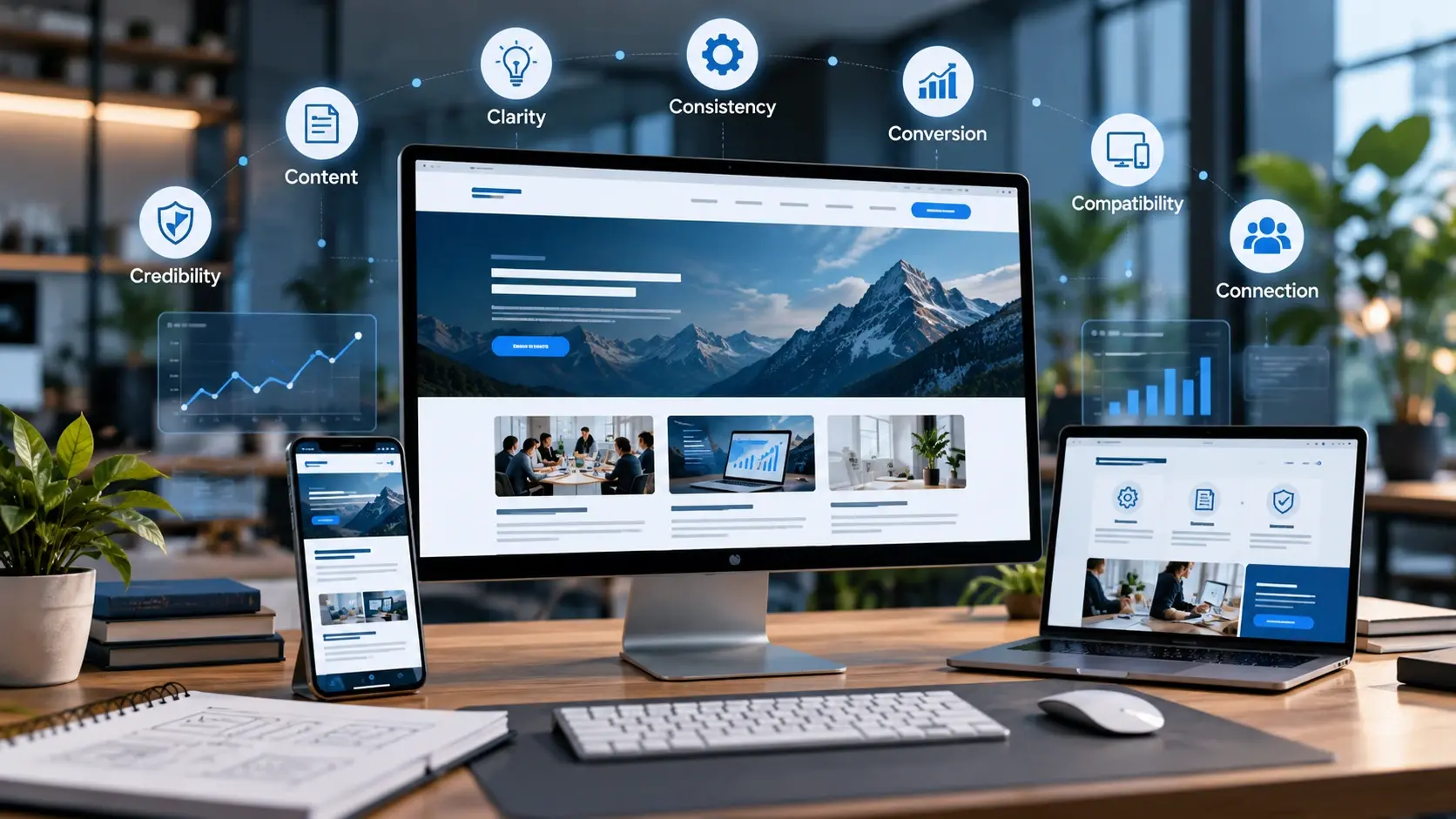
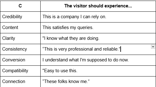
There are 7 C's of a good website: Credibility, Content, Clarity, Consistency, Conversion, Compatibility and Connection.
A visitor has to trust that your business is real before they purchase from you, contact you, book an appointment, or fill out a form.
This may seem like a no-brainer, but many websites make trust difficult.
I have seen business websites that stated that they are experienced, professional, and customer-focused, but the website had:
Business itself might have been a fine one. The site just didn't convey that.
This is a key difference.
Your credibility doesn't just magically appear on your website. It conveys your trustworthiness.
Take an example: when you're searching for a solicitor.
Website A says:
Website B:
Either one of them can offer great legal representation.
However, Website B provides the visitors with more proof to support the decision to trust the firm.
What makes a website credible?
View your website through the eyes of a stranger.
Can they find:
Implement payment or enquiry mechanisms as appropriate?
It is even more critical in the case of professional services, healthcare, finance, legal services, and other high-trust sectors.
No visitor should have to do the detective work to find out what you're about.
Provide them with the proof they require.
A simple test
Ask:
You need to provide your customers with answers to their questions, not the ones you think they are asking.
The biggest website error I see is creating content based on what the company wants to write, instead of what the customer wants to know.
Businesses are fond of talking about themselves.
Generally, customers are self-interested.
But that doesn't mean your website should overlook your company story. The story should relate to the visitor's problem.
Weak:
We offer innovative digital transformation solutions with the latest technologies.
Better:
Looking for a CRM that your team will use? We develop custom CRM systems for businesses to handle leads, follow-ups, customer data and sales process in a unified system.
The second version provides the visitor with something useful right away.
It answers:
Useful content.
Good website content diminishes uncertainty.
Consider what might happen before the customer calls you.
They may be wondering:
Unanswered questions lead to uncertainty.
Your website can eliminate that doubt before the sales conversation even starts.
This is why useful content is more than just keyword placement for SEO.
It's a part of the user experience.
Write for the person then optimise for search.
SEO still matters. Search engines have to know what your page is about.
However, a page that is full of keywords is unnatural.
Instead, it is best to know what the searcher is looking for initially.
If someone searches:
That is useful SEO.
It's additionally helpful website content.

If you're trying to get a visitor to solve a puzzle to understand your website, you should not be.
The quickest way to check clarity is to just view the top part of your home page.
Do you have any answers to these three questions?
If they can't, then the homepage is in need of some work.
This is where many of the appealing websites fall down.
They use clever headlines such as:
Or:
They are often slick, but reveal very little to the visitor.
Compare that with:
A website becomes cumbersome when users need to guess where they will find the information.
The rule is easier to explain:
Give them a task:
Now visualize your own home page.Now picture your home page of your company.
Then you go to the services page.
Different fonts.
Different button styles.
Different colours.
Different writing tone.
Then you arrive at the blog, and it feels like it's from another company altogether.
That creates friction.
The consistency is important for visitors to develop a mental model of the website.
This includes:
There is another kind of consistency that's more important, though.
Promise consistency.
Assume that a company states:
Or a company says:
However, the contact form does not provide any information about the time of the response.
The website has promised and then not followed through.
Good websites make the experience equal to the message.
You might have thousands of visitors to your website and get virtually no business.
Traffic is not the end goal.
The question is, what is the important question?
What is the desired action of the visitor?
This might be:
This is what a good website will make easy.
Conversion is removing friction.
Suppose a customer is interested in getting a quote.
You ask for:
How they were informed about you
Perhaps all of those fields are internal.
Probably not.
This is why the initial questions of conversion optimisation tend to be very mundane:
It's the concept of facilitating the desired change.
Your CTA needs to be on par with the intent of the visitor
A person reading an introduction blog post might not be prepared to:
"Buy Now."
However, they may be willing to:
"See How It Works"
or:
"Get the Free Guide"
If someone has already been to your pricing page, they might be closer to:
The call to action should be relevant to the context.
A website is not complete until it appears well on the user's screen.
It must be usable by real users.
That means checking:
Mobile is a key consideration because if the experience isn't good, a great site can be a frustrating experience.
You know how it feels when you're feeling down.
You launch a website on your mobile device and you begin:
The website at this stage is requesting the visitor to do work.
The visitor shouldn't have to work so hard.
Technical performance also counts!
Technical quality is also related to compatibility.
A website should be:
This is where web development and SEO meet.
While a search engine can find your website, if the user experience is bad, then rankings will not be the answer to the business problem.
The purpose is not just:
It's the C that most technically savvy websites lack.
A website can be fast, responsive, well-organized and yet be completely devoid of life.
Users do not talk to websites.
They reach out to businesses via websites.
That distinction matters.
Compare the following two messages:
We are dedicated to providing innovative solutions to help businesses grow.
with:
“Your website shouldn't require a 30-minute explanation to the customer about what you do, we can help businesses to make their website simple and make it more user-friendly, and convert more of their visitors into enquiries.”
This may involve:
That could be as simple as explaining to patients what to expect at their appointment for a medical practice.
It could be demonstrating the software's practical utility in a software company.
In the case of a local service company, it may involve displaying the actual staff, service area and work done.
Relevance and honesty are the bases of connection.
Don't make all websites funny or informal.
It's just a matter of making it sound like there are real people behind it.
These principles aren't seven separate website checkboxes.
They impact one another.
The conversion is more difficult due to poor clarity.
The credibility is more difficult to develop if the content is weak.
When it's not consistent, it ruins trust.
When there is poor compatibility, friction occurs.
The complete corporate tone can dilute connection.
No design can address any of these issues forever.
This is likely the most crucial lesson.
The web owner will frequently ask himself:
“Does it look good?”
Designers may ask:
Developers may ask:
SEO teams may ask:
But before that there is another question that should be asked:
When creating or redesigning a website, ask yourself these questions.
Credibility
Content
Clarity
Consistency
Conversion
Compatibility
Connection
A website should not be built because it's expected that all businesses will have one.
It ought to be helpful to people.
It should enable someone to grasp a problem, assess an option, believe a business and take the next step without undue hassle.
This is what makes a website great.
The most animated, the most pages or the most expensive design does not necessarily make the best website.
It's the one in which the visitor can say:
I know this, I believe this, it's important to me, and I know what to do next.
When you can create that experience regularly on your website, you're on to something.
If it can't, then the solution could be a different redesign.
Begin by finding out what your visitors are having trouble comprehending.
After that, repair that.
What makes a website actually good?
A good website makes it easy for visitors to understand the business, trust it, find the information they need and take the next step. It does not have to be the most expensive or visually complex website. What matters is whether the website works well for the people using it.
What are the 7 C's of a good website?
The 7 C's are Credibility, Content, Clarity, Consistency, Conversion, Compatibility and Connection. Together, they cover the main areas that influence how people understand, trust and use a website, from the first impression through to taking action.
How can I tell if my website is good?
Try looking at your website as someone who has never seen it before. Within a short time, you should be able to understand what the business does, who it helps and what you can do next. You can also ask someone unfamiliar with the website to complete a simple task and watch where they struggle.
Why is website clarity important for conversions?
Clarity reduces the amount of thinking a visitor has to do. If people cannot quickly understand what a business offers, who it is for or where to go next, they may leave before taking action. Clear headings, navigation, content and calls to action make the next step easier.
Does a website need to be expensive to be successful?
No. A website does not become effective simply because it has expensive design, animations or a large number of pages. A relatively simple website can perform well when it is trustworthy, easy to understand, useful, technically functional and designed around what visitors actually need.


 Seo Admin
Jan 21, 2026
 Seo Admin
Nov 07, 2025
 Seo Admin
Apr 17, 2026
 Seo Admin
Dec 24, 2025
 Seo Admin
Jan 30, 2026